Episode #5: Bad Metrics
[The One Where We Discover That Bad Metrics Can Lead to Good Questions
Previously on Tales From a Metrics Journey…
In Episode #4, Mojtaba and his teams realized that they needed to make their work visible in order to start gathering metrics, which meant instrumenting their services and capturing work appropriately. With this Step 0 complete, let’s see how they did with turning their data into metrics!
Data != Information
Once we had a few iterations and sprints with several weeks of data collection, we held a meeting to review the data and visualize what we had collected.
Danger averted
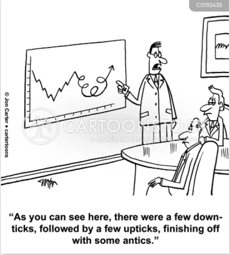
Prior to that meeting, we had to fight off the temptation to fall in love with visualization for the sake of pretty visualization. The tool we used for visualization had many choices of graphs and plots, with a variety of color palettes, zoom capabilities, and other bells and whistles. We had to work hard to focus on the outcome (getting insights from data) and avoid getting caught in the activity (visualizing data).
Pretty Graphs With No Information
Once we had some of the data visualized, we met to review them and found that many of the visualizations didn’t tell us much!
For example:
- A service’s latency was all over the place and the variations were just too great.
- Sprint Velocity was all over the place from sprint to sprint.
- Deployment lead time was highly variable, and there was no pattern to the variability.
- Incident categories showed breakdown by severity but that didn’t tell us much.
- Team workload showed ticket breakdown of support, feature, and tech-debt but didn’t seem to tell us anything of value.
- Cycle time on tickets was all over the place.
We were facing the realization that data, even when visualized beautifully, does not necessarily mean information or insight.

How To Go From Data to Information?
Looking at the garbled data, our first inclination was to give up and move on - “it’s just too hard to capture our work in dashboards.” Instead, we persevered and started asking lots of questions:
- “Why is the latency graph for the service so erratic? Is there a parameter we’re not taking into account? Should we break down latency by API call?”
- “Do we care if sprint velocity is erratic? Would the average over several sprints be enough? Is the average also erratic? What can contribute to sprint velocity being so variable? Should we examine our story pointing process?”
- “Why is deployment lead time so variable? Should we break it down further based on service/module?”
- “Incident severity breakdown doesn’t tell us much. Are we looking at the right data? Should we also categorize root causes? How about the time it takes to get to the root cause? How about time to put corrective measures in place?”
- “Is it helpful to have a number of tickets as a measure? What about sizing? Is relative number important? Or should we be looking for trends over time and ignore the relative number of tickets?”
- “What is cycle time dependent on? Should we do a breakdown of cycle time according to category of work?”
As soon as we asked these questions, we came up with:
- Hypothesis: a guess as to why some metric was erratic, or a guess that another companion metric would help explain and break down the data to show actual insights.
- Action: a list of things for us to try for the next review.
By asking questions, and taking actions from these reviews, we were able to iteratively move from bad metrics to better metrics.

On the Next Episode
Tune in to the next episode to see how we approached measuring technical debt for development teams!
Lessons Learned
These were some of our key takeaways:
- Data is not the same as information (so collecting and visualizing data isn’t necessarily helpful on its own).
- There is a danger in falling in love with visualization and tools instead of caring about the insights.
- There is a danger in giving up when staring at confusing data.
- Asking questions can help you go from data to information.
- Periodic review of data is necessary to get to these questions.
- Periodic review of metrics should lead to new hypotheses and actions.
- By asking questions and taking action from reviews, we can iterate away from bad metrics to better metrics.
[ Guest post from Mojtaba Hosseini ]