Episode 10: Visualizing Metrics, a Messy Business
[Previously on Tales From a Journey Around Metrics
Mojtaba’s journey into metrics episodes were interrupted last by a few other posts on metrics related to build org. We left off in episode 9 where even crude workload metrics were helpful in setting up a team to have productive conversations.
Before Visualizing: A Humble Beginning
Before visualizing ther (workload) metrics, the team in episode 8 started to report their workload in a Google Doc. It read something like this:
- Covering period: April 2019
- Total Number of JIRA Issues Opened = 120
- Total Number of JIRA Issues Closed = 80
- Issues Opened By or Due to External Teams = 70
- Issues Opened For Support = 30
And so on.
This sort of information presentation was very difficult to read, and more importantly to difficult to interpret. It had several limitations:
- It did not show trend from previous months.
- It forced the reader to do mental-math (what % of Issues Opened are external vs internal).
- It forced the reader to do mental comparisons and breakdowns (team closed 80 issues, while 120 were opened).
Next Step: Visualization, Take One
In their next iteration, the team decided to put their collected metrics into Google Sheets and then use built-in visualization to help readers better understand and interpret (and ask questions of) the data.
The first iteration looked something like this:
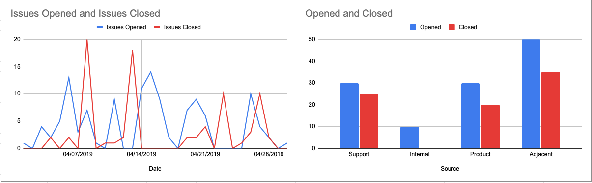
Looking closely at these, it was easier to read the data compared to it in Google Docs but there were still problems:
- The graph on the left is almost meaningless! What did the left graph tell us? What does it mean?
- The right chart shows opened vs closed based on the source of the ticket but we’re not sure if they are closing the same tickets opened or from before.
- It’s also hard to compare the sources of tickets opened with each other (e.g. is “internal” opened 5x fewer than “adjacent”?)
- Small detail but do the colors (red,blue) mean anything?
Problems With Visualization
Visualizing data and metrics is fun! It’s also difficult and messy to get right. Teams that begin to visualize their metrics end up having possibly good looking visuals that are empty of value. One of the pitfalls of engineering metrics is to rush to visualize, and to visualize for the sake of it.
Stay Tuned
Keep an eye out for Episode 11, where Mojtaba will share how the team learned to make the visualization more useful!